Social media design
NommeKitchen & Coffee Theatre
Instagram design for a restaurant that opened as a coffee theatre — a dining room built around a performance, serving patisserie, coffee and a kitchen that runs from Hyderabadi to Italian-Chinese.
Social media design and campaign artworkFeed posts, carousel sets and stories · 104 pieces
- Client
- Nomme Kitchen & Coffee Theatre
- Where
- Banjara Hills Road No 2, Hyderabad
- Platform
- Formats
- 4:5 feed, carousel sets, 9:16 stories
- Pieces
- 104 in the collection
The restaurant's own name does the positioning: Kitchen & Coffee Theatre. The creative takes that literally rather than decoratively — the curtain, the ticket and the show turn up as devices across the campaign work, and the food posts are built to name what is in the dish. This page shows the pieces where those two habits are clearest, then the full set.
The name is the concept
A restaurant called a coffee theatre gives you a stage, a curtain and an audience to design with. Using them keeps the campaign work recognisable without a house colour to fall back on.
A curtain, and a reason to swipe
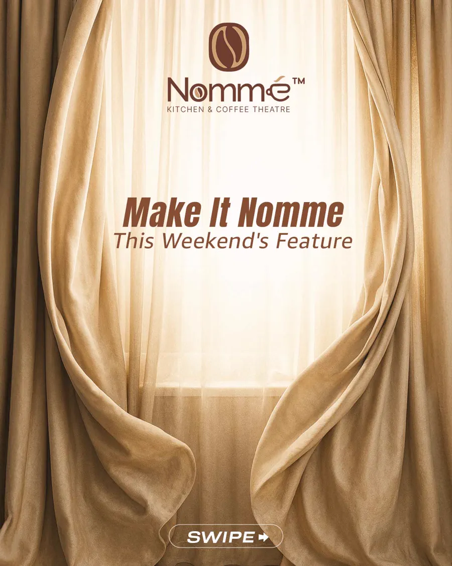
The weekend feature opens on a parted curtain with the light behind it, and the sub-line borrows theatre language — This Weekend's Feature, not This Weekend's Offer.
The SWIPE prompt sits at the foot of the frame. It marks the cover as the first card of a carousel, so the format is legible before anyone reads the headline.
Every dish is named and itemised
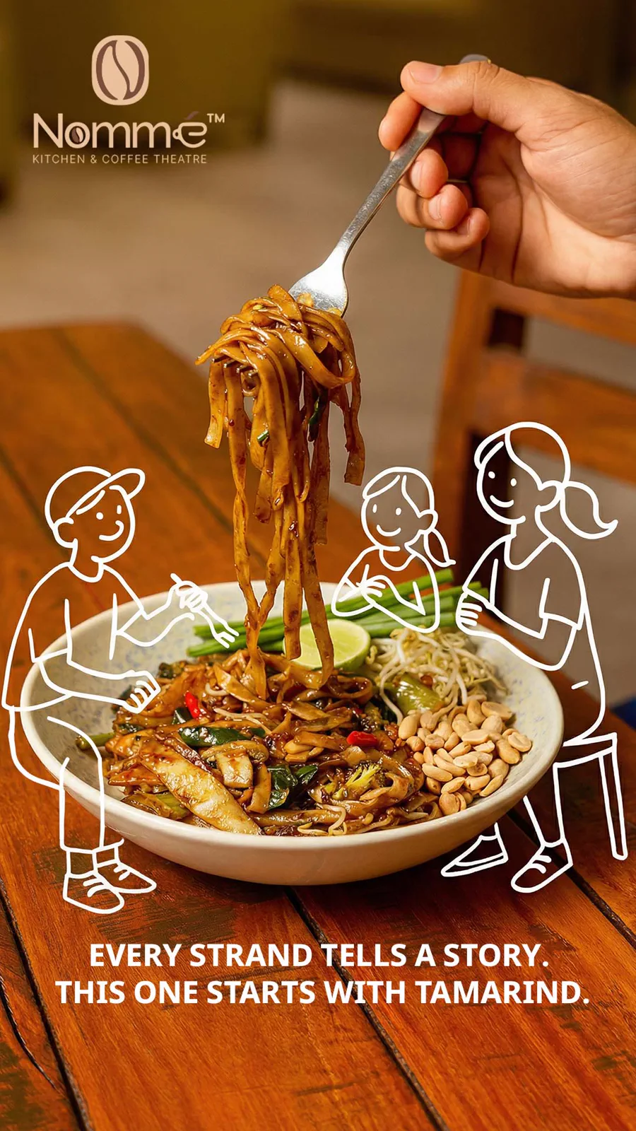
The most repeated decision across the set is informational: a food post says what the dish is and what is in it. It holds whether the plate is a Hyderabadi fry or a French entremet.
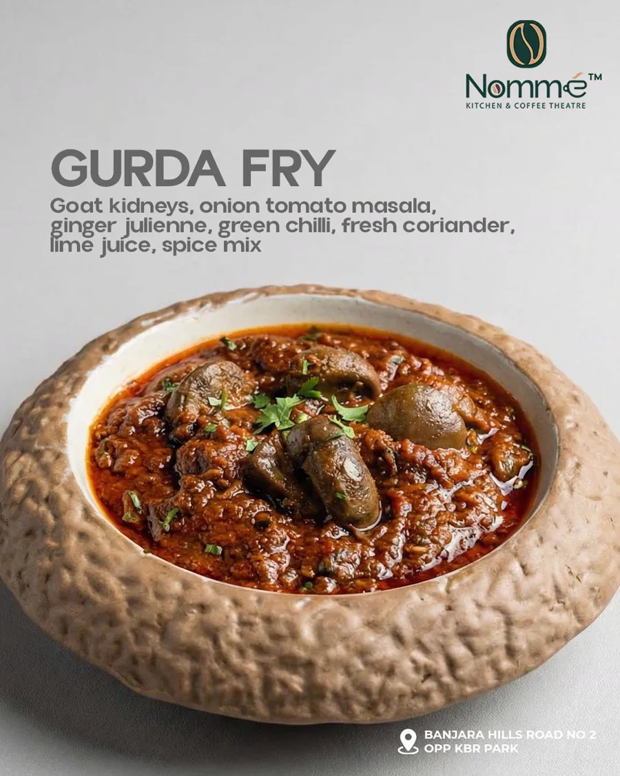
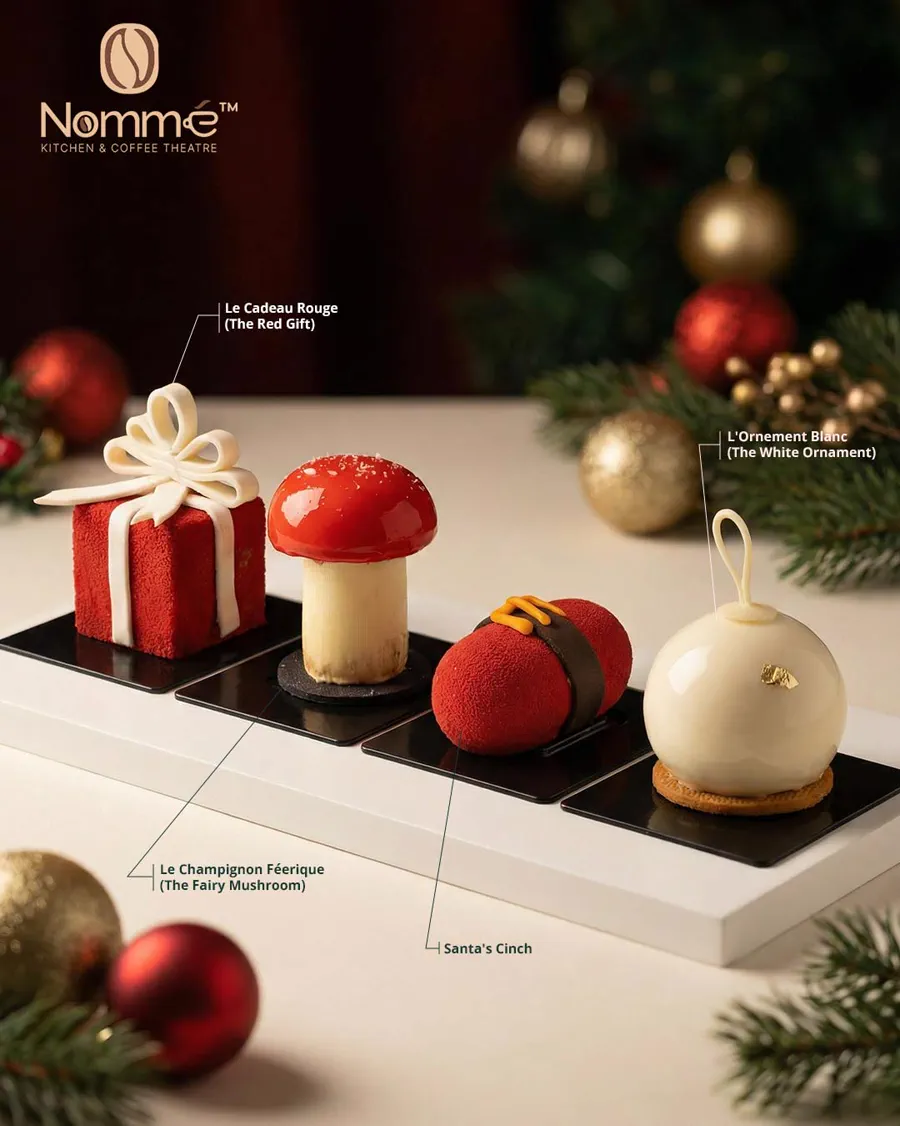
Two ways of doing the same job. Gurda Fry puts the ingredient list directly under the dish name, so the post reads like a menu entry. The Christmas plate uses leader lines instead, naming each entremet in French with the English in brackets — four items in one frame without a caption to explain them. Both leave the photograph uncovered.
One lockup, recoloured to sit on the photograph
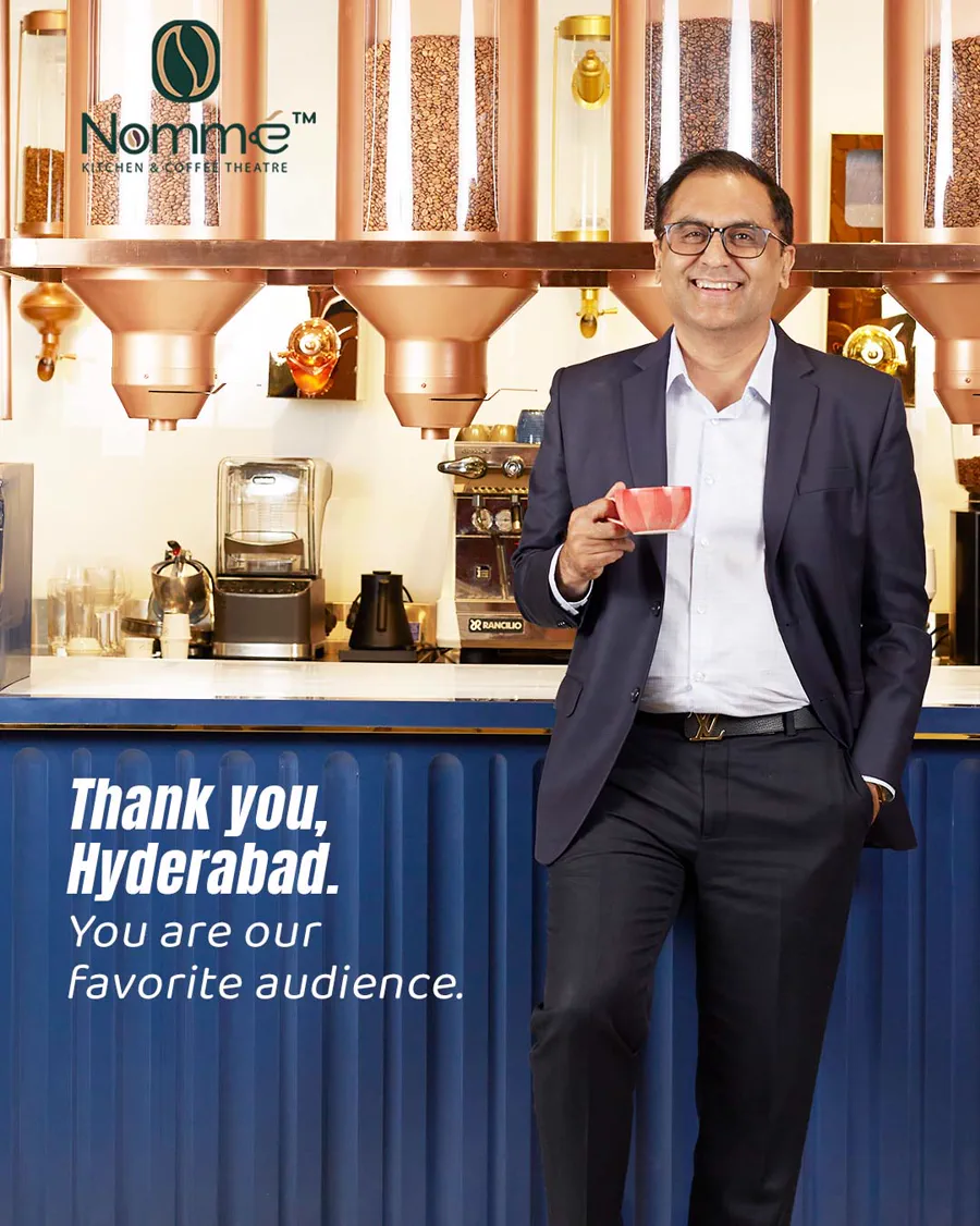
The mark moves, the layout does not
The logo appears in brown, cream, white and green across the set. Which one is used follows the photograph underneath it rather than a fixed brand rule.
Here the counter shot already carries copper and navy, so the mark goes green and sits top-left in the clear area. The headline keeps its place at the lower left in the same bold italic used across the campaign pieces.
That is what makes the grid read as one account when the photography ranges from a lit interior to a plated dessert to a festive tabletop.
Campaign work that stays inside the metaphor
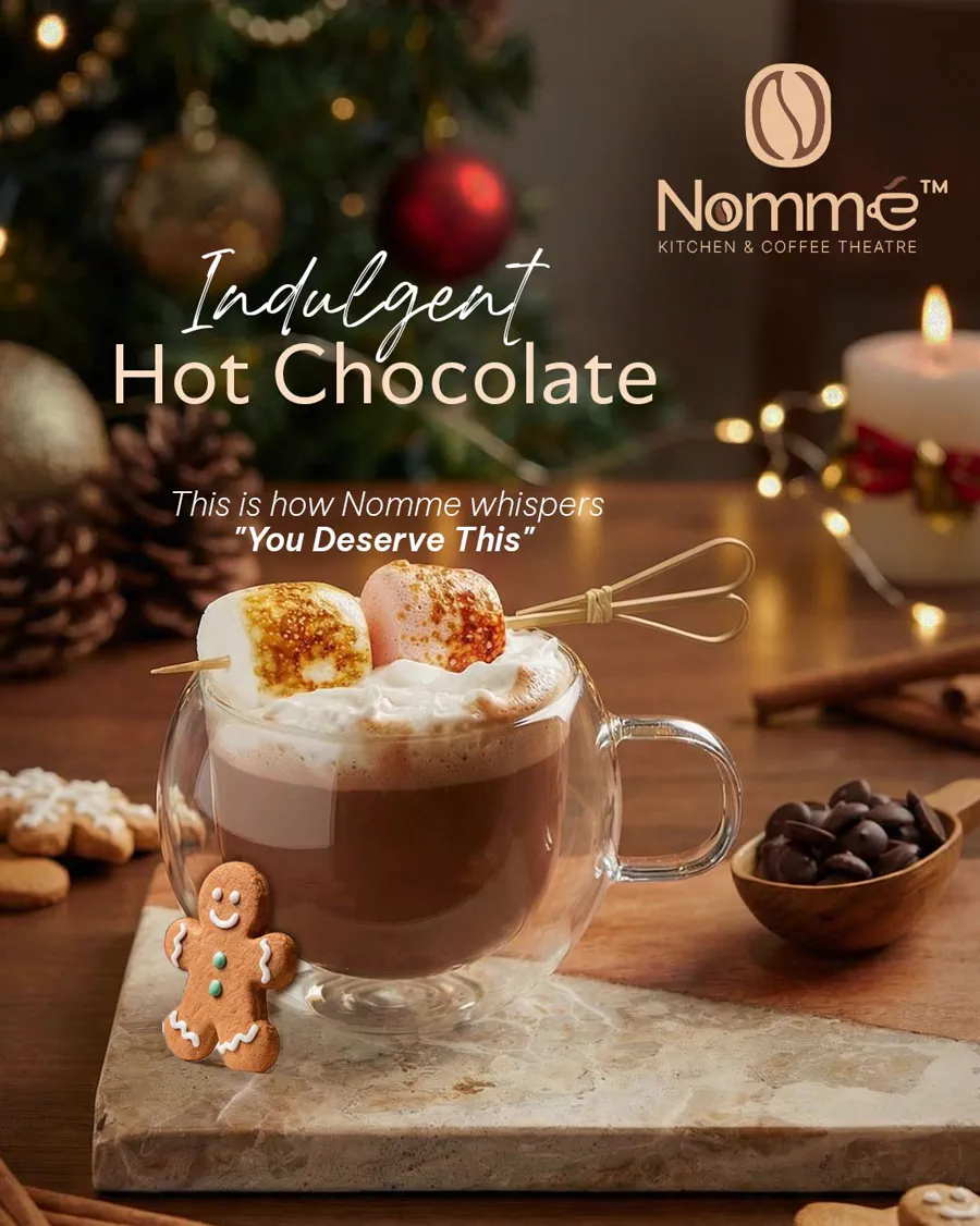
Seasonal posts could have defaulted to snowflakes and a discount. Instead they extend the theatre idea — which keeps the seasonal set tied to the restaurant rather than to the season.
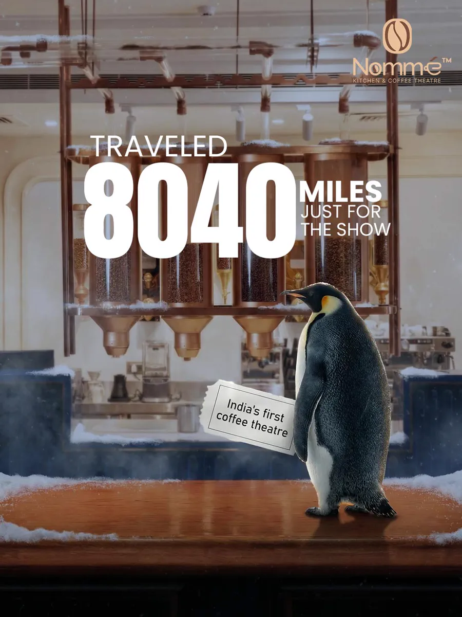
Announcements carry the practical information
Opening and location pieces are the ones a customer acts on, so they end with everything needed to act.
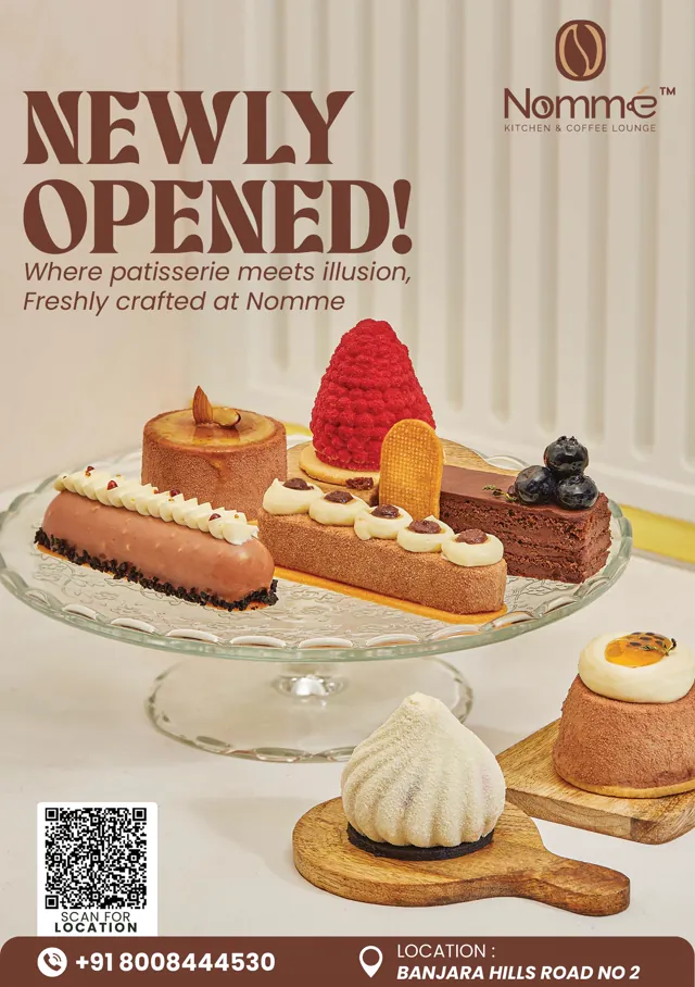
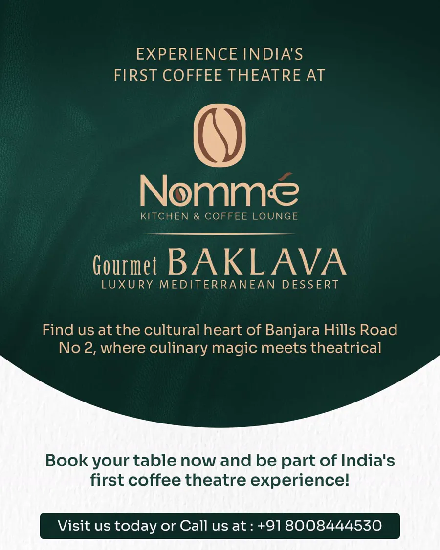
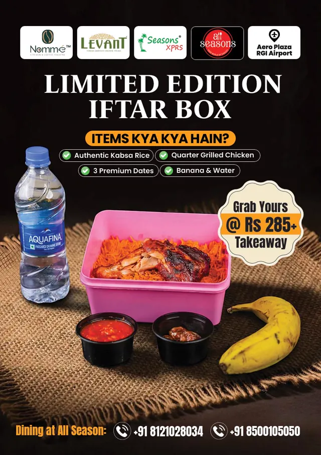
The opening post ends in a footer bar: a QR code labelled Scan for Location, the phone number, and the street address. The middle piece is a co-branded lockup — Nomme above Gourmet Baklava, separated by a rule so neither mark competes. The third runs a five-logo partner bar for an airport Iftar box and asks the question in the local register — *Items kya kya hain?* — then answers it with four ticked lines and a price. On the first two the logo still reads *Kitchen & Coffee Lounge*, the earlier version of the name.
A story built to carry coverage
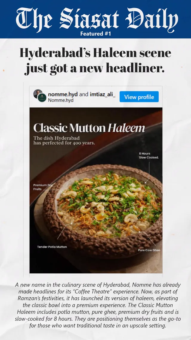
When the post has to carry a whole menu
Not every piece can lead with a photograph. The New Year set had to fit a full festive menu into one 4:5 frame and still be readable on a phone.
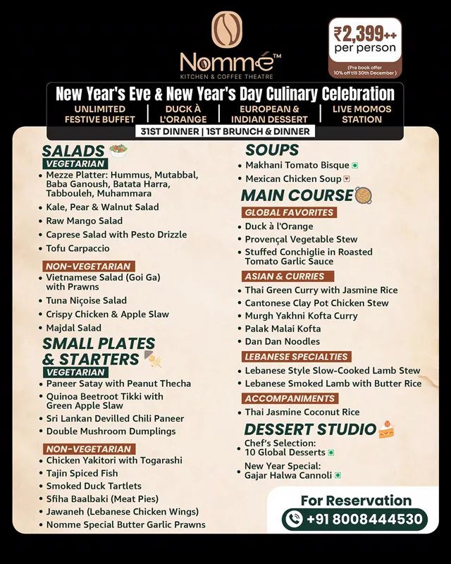
Two columns, and the conventions people already read
Around fifty dishes are set in two columns under running heads, so the eye scans category first and dish second rather than reading a list top to bottom.
Inside each category the menu splits vegetarian and non-vegetarian and marks every line with the green and brown dots Indian menus already use. Nobody has to be taught how to read it.
The commercial detail is kept out of the type: a price badge sits top right carrying the per-person rate and the pre-book condition, and the reservation number closes the frame.
What was delivered
Counted from the artwork in the collection. Grouped by the frame each piece was built for, which is the part that can be counted rather than characterised.
- 654:5 feed posts — the everyday menu, offer and seasonal plates
- 31Other portrait frames — carousel covers and taller campaign pieces
- 59:16 stories, including the press-clipping template
- 3Square and landscape pieces
A wider look at the set
Twelve pieces across the formats. Open any one for the full-size artwork, or go through to the complete collection.
12 of 104 shown
View the complete Nomme social media collectionLook closer
Need a consistent visual identity for your restaurant?
If you have good food photography and no system holding it together, that is usually the gap worth closing first. Tell me what you serve and where, and I will tell you what I would make.