Financial social media design
TradeJiniStockbroking and the CubePlus platform
Market-explainer creative for a stockbroker — the kind of post that has to make a corporate action legible to a retail investor without a chart.
Social media design, market explainers and platform UI showcasesLinkedIn and feed formats · 109 pieces

- Client
- TradeJini
- Sector
- Finance and trading
- Platform
- LinkedIn, per the collection page
- Scope
- Market insight posts, platform UI, investor education
- Pieces
- 109 in the collection
A stock split is an abstraction. The approach on this account is to show the company instead of the security — the products a reader already buys — and let the numbers do the surprising.
Explain the event with something the reader owns
The Nestlé India split could have been a candlestick chart. It is a shelf of Maggi packets instead.
The number first, the mechanism second
The headline is the price change on its own — ₹24000 to ₹2400 — set in a green pill so it reads before anything else at feed size.
Two hand-drawn arrows connect that number to the single line that explains it: *Nestle India announces first-ever stock split in the ratio 1:10*. One sentence, no jargon stack.
A Swipe marker sits on the right edge, so the cover announces that the detail continues in the cards behind it.
What was delivered
Counted from the artwork in the collection, grouped by the frame each piece was built for.
- 90Square posts — market events, explainers, platform UI
- 144:5 feed posts
- 5Landscape pieces
A wider look at the set
Open any piece for the full-size artwork, or go through to the complete collection.
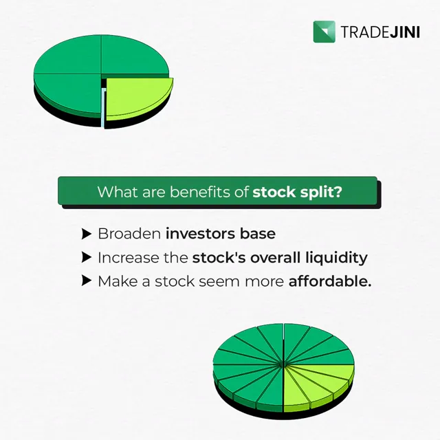
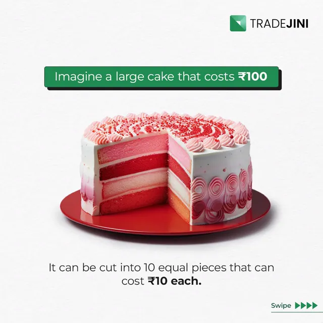
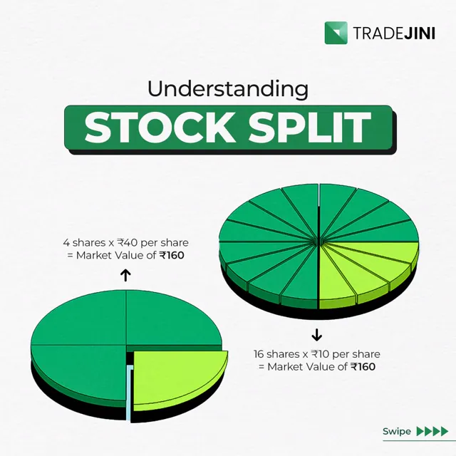
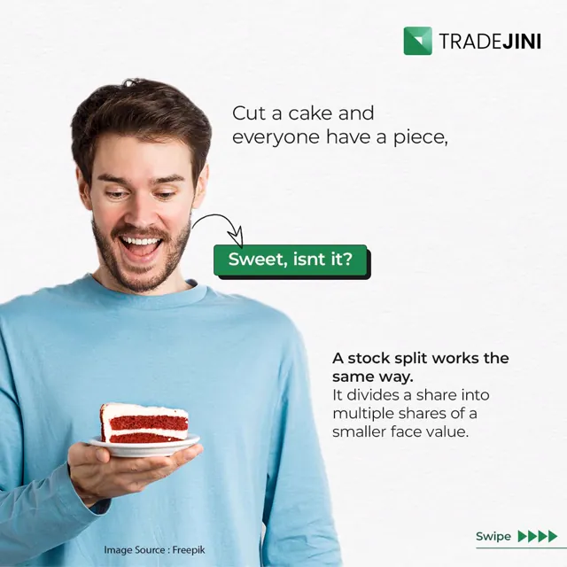


8 of 109 shown
View the complete TradeJini collectionLook closer
Explaining something financial to people who are not in finance?
Most of this work is deciding what to leave out. If you have a product or a market story that keeps getting explained badly, tell me about it.