Website — designed and built
Xavik LabsStudio website — my own company
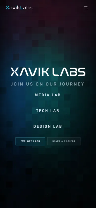
The website for the studio I co-founded, built to explain a three-part structure — media, technology, design — without making a visitor read an org chart.
Co-founder. Identity and front-end buildNext.js · design system · dark interface

- Company
- Xavik Labs
- My role
- Co-founder · design and development
- Build
- Next.js
- Interface
- Dark, with a shared design system
- Status
- Live
As co-founder I help shape the studio’s operations, execution and direction. For the site itself the brief was narrow: explain that the studio runs as three connected areas, show the work, and make starting a project easy.
The site, as it ships
Screens from the live build.
Three labs, one system

Look closer
Need a site that explains how your company is actually organised?
Structure is usually the hard part, not the styling. If your offer keeps needing a paragraph to explain, that is a layout problem worth solving.

